Week-13
Feedbacks & reflection
Feedback from openstudios
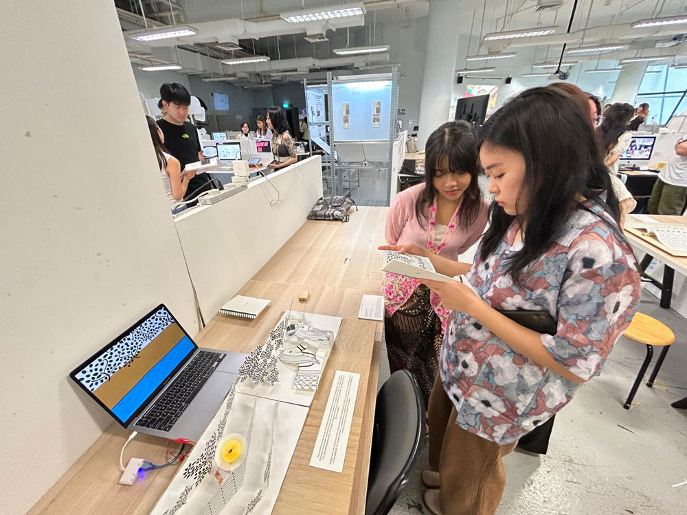
I got plenty feedback that I found helpful planning what to do next. In my open studios set up I had only set up my prototype and all the information about it. I was quite underconfident that my concept is not being communicated well. Then when I met one of the alumini - Martin, he asked for more infromation, and then I showed him all my experiments, and he mentioned that the experiments are really good and having them in my presentations also add a lot of value to my current prototype. His feedback helped me derive a frame for my final deliverable, as also discussed with Andreas - that I present my work as 'experiments I conducted to make a book interactive, and the final artefacts as a version of what I achieved through all the experimenting and prototyping.'
Some of the participants that tested the prototype did mention that it would be good to have more interactive components within one spread, and that it would be cooler to see it as a long spread instead of a book. Along with it, I got a feedback that my visuals don't translate from the interactive storybook to the screen. I believe it could be due to the visuals being coloured on the screen and black and white on the books. As for final outcome, I want to stick to black and white visuals with just the areas with interactive components being coloured. I got a feedback from Roundtable - 2 that it could be better to have the visuals coloured however I personally preferred black and white visuals.
Additionally, I got feedback that it would be nice to have text on screen, as it is quite confusing how to interact with the prototype. "the best interactive design is the one that's intuitive" - I don't know why I percieved that it meant zero instructions. I feel like an aim to build an intuitive design and getting suggestions to add instructions is quite confilcting. I am a bit confused with how to proceed further with this.
Things to consider as I progress further
1. Can explore with adding conductive paint on the spread, for
additional interactive components within one spread.
2. I can continue with black and white visuals, with just
having colour around the interactive component.
3. I am still confused whether to add some instruction or
visual reference to my book for interactivity. What Andreas
mentioned about an interaction desing being intuitive, has
stuck by me.
Lab workshop with Andreas
In this lab workshop Andreas helped me in merging the p5js codes of both the spreads and additionally I shared some questions I had. For example, if I can have additional interactive component such as conductive paint.
Roundtable - 3
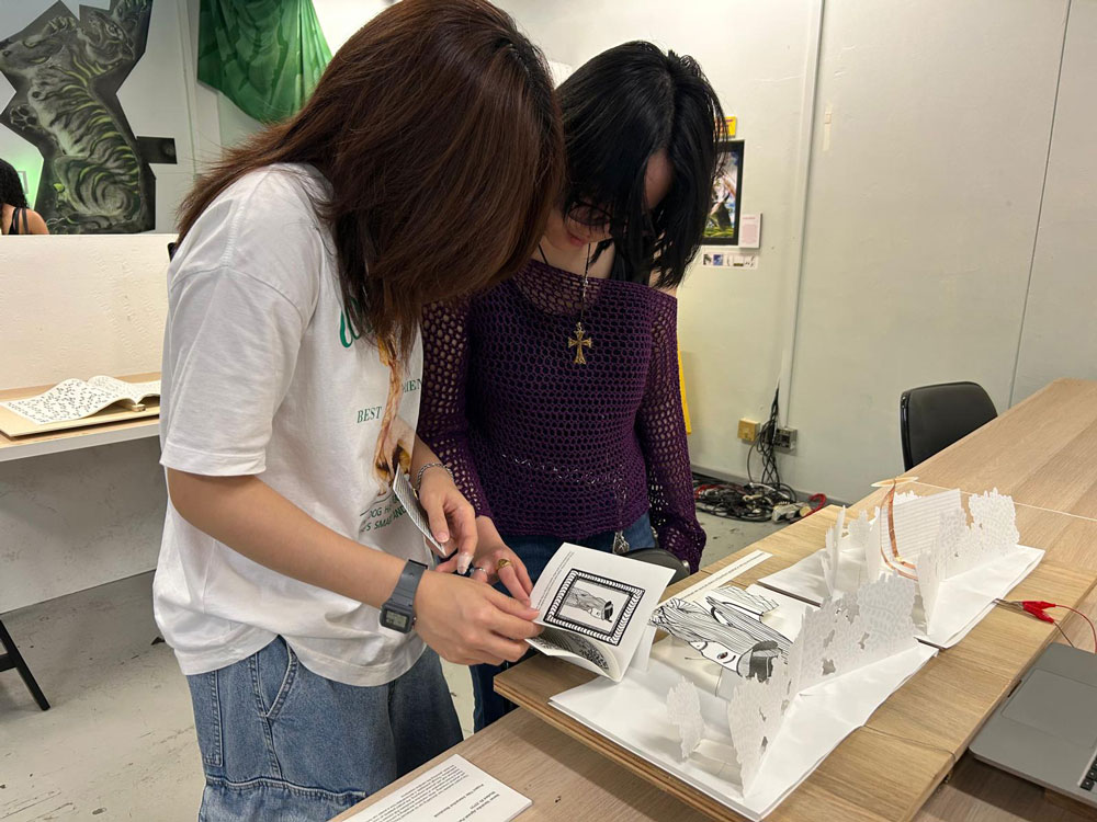
I had this roundtable with Vikas and Nicholas. In roundtable - 3, I presented with slides while also giving a brief background about the primary concepts and the research questions for this project. Taking Martin's advice, I began with presenting all my experiments and prototypes from semester-1 till present and it actually worked quite well in communicating my project and I ended up getting really good feedbacks. Although they are mostly leaned towards the production aspect of my project.
Feedback
The importance of the storyboard was emphasized — it helps clarify what I am trying to achieve with the interactive storybook. This roundtable focused more on production aspects than technical ones. For example, the pop-ups: the size of the paper needs to be reconsidered because the pop-ups currently pop out when closed, and it’s confusing which direction to view them from. It was suggested to use different grades of paper, such as a thicker base or card-like paper for the pop-ups. There was also a comment that I shouldn’t waste the opportunity to design beyond the traditional book format — it could be something really long, similar to how board games use their packaging space for design, instructions, and visuals. The audience interaction was discussed too — for instance, imagining a 4–5-year-old with an adult, where the instructions are more poetic and intuitive, like “the eye that envisioned the city” to hint at interaction without being direct.
Specific feedback on spread two suggested not needing a wall between the book and screen — perhaps the book could feature the sun while the screen shows the wall, but this raises the question of how to maintain consistency between book and screen visuals. It was noted that while the pop-ups are more scenic than action-based, there could be more consistency across the two mediums. There was also a suggestion to consider fabric for the book covers, as the visual quality on fabric (seen during the December workshop) was better compared to the current pop-ups. The quality of certain elements, like the hair on the Sultan, was critiqued as not blending well with the rest of the pop-up visuals. Finally, it was pointed out that it’s still unclear how I plan to balance the user's focus between the book and the screen without one dominating the experience.
Takeaways from roundtable - 3
I liked the idea of having different visuals in the spread and the screen and still fining a way for the visuals to translate to the screen. Additionally, I considered adding indirect instructions to all my interactive pop-ups, which may maintain some intuitivity while also not leaving the users completely clueless.
This roundtable gave me a lot of clarity about my project and helped me feel quite optimistic about where this project could direct to.
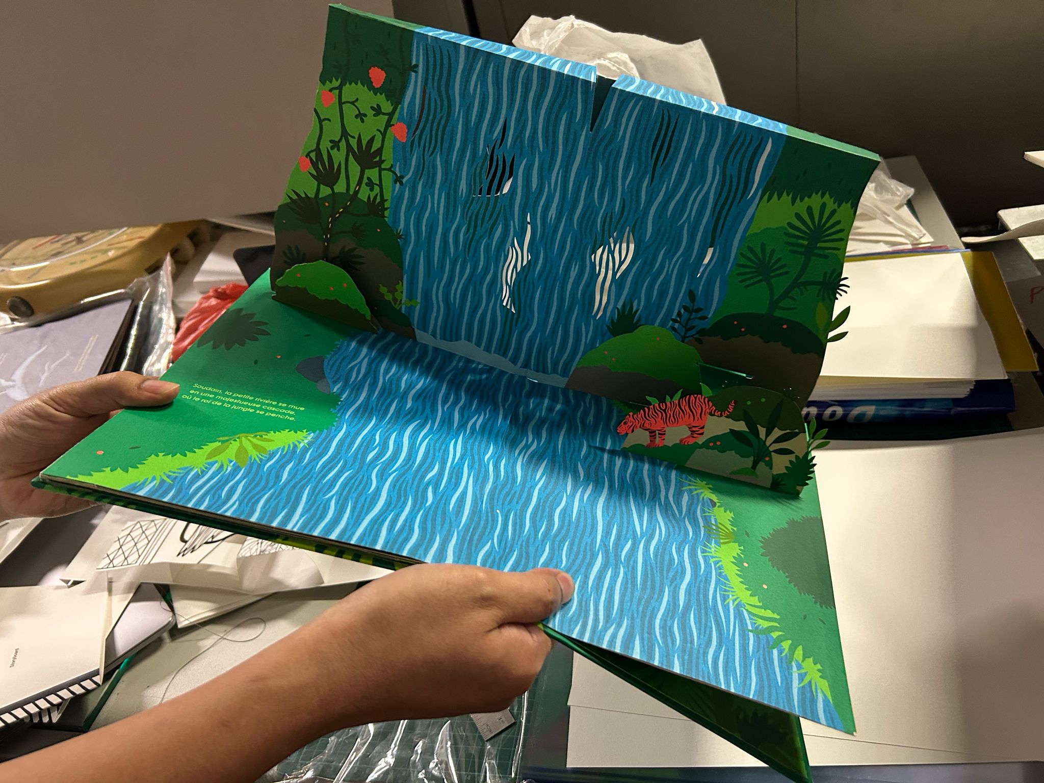
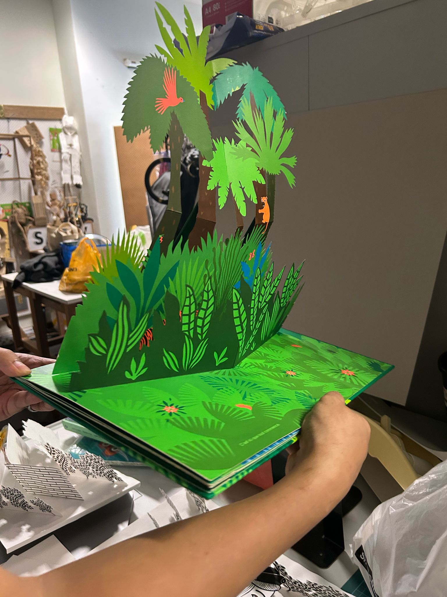
Image & Materiality lab with Andri & Vincente
During this lab consultation, Andri showed me a pop-up book which helped me understand the mechanism of pop-up styles that I am using. The book served as a precedent for my interactive pop-ups. What I really enjoyed about the book was that there were minimal pop-ups and more visual detail which made the look of the book feel quite complete. Additionally, the text on the book, quite small but still significant. The style of this book is something I am considering to adapt in my pop-up book. Andri also mentioned that at this point it is best to stick to simple V-fold pop-ups. And he additionally mentioned to use gray-board as a base and 280gsm paper for the pop-ups, so they are able to stand when the book/spread is opened. Andri even mentioned to make the size of my pop-up bigger, but given the deadlines and the amount of work to do, for the time-being, I decided to stick to the size I had used already in my prototypes.
Pop-up testing
I had never used grayboard before so I took this weekend to first test how I can use it. Additionally, I tested a v-fold longer than the book. Although, the long v-fold was quite complex to make and required a lot of time to figure out the right placement and angle, hence I finally decided to stick to smaller sized simple v-folds for the final artefact.